Flowers: Approaches & Techniques
Flowers, pretty girls and local scenes — that's what sells at amateur art shows. But flower oil paintings do not deserve their stigma among more professional artists. Too many flower oil paintings are over-pretty, what the trade calls 'chocolate box pictures', but the methods of avoiding such problems are many and obvious:
 1.
learning from botanical illustration to studying
flowers closely
1.
learning from botanical illustration to studying
flowers closely
2. bringing out their intimate character, which is much more than the surface attractiveness of the flower
3. exploiting their bright hues in unusual compositions and color harmonies
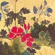
4. following oriental painters and concentrating on spatial and compositional aspects
5. taking a semiabstract approach, employing a vocabulary of forms and colors generated by detailed study of flowers
It's not that flowers are attractive to those who care nothing for painting, or that they appeal in non-artistic ways. The trouble is that the appeal is strong over a very narrow base of painterly concerns — essentially flamboyant shapes and rich colors. But that itself indicates what has to be done. Not to deny the obvious appeal of flowers, which is pointless and hardly honest, but look for and develop other features. And this is no more than what all artists do, whatever the genre. The good landscape painter, faced with a rain-soaked fields, gloomy farms and a featureless sky, is immediately finding ways of conveying the scene through unusual viewpoints and heightened contrasts in a much limited palette. What emerges is a 'strong' picture, possessed of an atmosphere hardly to be found on a pleasant summer's day. The same advice holds for flower painters: observe, explore, get beyond their surface looks and bring out their hidden natures.
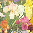
Pictorial Realism
 The
first concern of botanical artists is accuracy.
That usually means very detailed drawings that carefully
explore the features important in the classification
and description of plants. How do the leaf bracts
spring from the stem? What is the exact shape of
the leaves, in the young plant and at maturity?
And the leaf serrations, the hairy undersurface,
the exact colors of the leaf decoration? And so
on. Only when these are fully recorded has the artists
developed a feel for the nature of the plant, and
can attend to the final illustration. The work reproduced
in photographic plates was often finished in watercolor
or gouache, of course, as these allow fine details
to be shown, though oil painting can be just as
detailed.
The
first concern of botanical artists is accuracy.
That usually means very detailed drawings that carefully
explore the features important in the classification
and description of plants. How do the leaf bracts
spring from the stem? What is the exact shape of
the leaves, in the young plant and at maturity?
And the leaf serrations, the hairy undersurface,
the exact colors of the leaf decoration? And so
on. Only when these are fully recorded has the artists
developed a feel for the nature of the plant, and
can attend to the final illustration. The work reproduced
in photographic plates was often finished in watercolor
or gouache, of course, as these allow fine details
to be shown, though oil painting can be just as
detailed.
But what is important is the study, the prolonged examination that generates a full understanding of the plant. That was the achievement of the seventeenth century Dutch painters and others. Their works are very good paintings, but they take no liberties with their subject matter. Everything is scrupulously observed and rendered: a photo-journalism of past floral displays. That requires great patience and manual dexterity, and indeed the larger oil paintings of flowers and fruits of different seasons will have been painted from life over many months or years.
These painters were specialists, and it's doubtful whether much of a market exists today for such highly finished articles. A lifetime of practice lay behind the acquisition of such skills, moreover, and today's artist is perhaps hardly encouraged to try. Nonetheless, many flower painters may want to produce one such painting, as an exhibition piece, a demonstration of their skills. And — who know? — if that does generate a commission commensurate with the time and effort involved, then a neglected branch of oil painting may well enjoy a new lease of life.
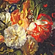
High Key Palettes
 Many
flowers have bright, even dazzling colors: how are
these to be conveyed? Essentially, there are two
approaches. Artists till the nineteenth century
generally used contrast to give the colors their
full brilliance. Flowers would be painted in deep
shadow on a dark background. The arrangements would
be such as to allow juxtapositions to bring out
their individual colors.
Many
flowers have bright, even dazzling colors: how are
these to be conveyed? Essentially, there are two
approaches. Artists till the nineteenth century
generally used contrast to give the colors their
full brilliance. Flowers would be painted in deep
shadow on a dark background. The arrangements would
be such as to allow juxtapositions to bring out
their individual colors.
That approach is still valid. Particularly in direct painting, the the tonal range needs to be quickly established. Color harmony has to be worked out, and largely adhered to. The reason why many amateur flower oil paintings can be fairly hateful is the neglect of just these aspects. There is not enough variety of tone, and the colors are a garish medley. Planning is the answer — and the informed study of past masterpieces.
But one should not make a virtue of necessity. The range of colors available to the seventeenth century artists was much more restricted than today's. Tertiary colors had to be mixed, and their muddy tints could only be make to look bright in relation to a prevailing darker tone. Most painters today prefer a lighter palette, and paint manufacturers have created a range of truly astonishing colors, synthetic and not cheap, but indispensable.
A word of warning then. The greater freedom can increase the likelihood of getting things wrong. You may need to give much more thought to color harmony, both because synthetic color juxtapositions create their own problems, and because the reduced tonal range deprives you of many devices to give depth and variety to the work. At their worst, high key flower paintings end up looking like posters — a respected branch of graphic design, but still design and not painting.
 Many
flower paintings fail in a way obvious to a photographer:
they occupy only the middle ground. Nothing in the
foreground to lead the eye in, and nothing in the
background to add interest to the subject. There
the flowers sit, in a vase on a polished table or
whatever. No matter how skillfully depicted —
the surface sheen of the table, the wrought silver
of the tray or the resinous refractions of the glass
vase — the painting is dead. Paintings involve
the whole surface of the canvas, and their aspects
work also in third dimension. Rather than place
flowers in formal compositions, therefore, it is
often better to create a painting in which flowers
emerge from a complex of other considerations. Or
the forms and colors derived from close study of
flowers are the real subjects of the painting. Or
are further developed in abstract compositions,
which their sources intriguingly hinted at.
Many
flower paintings fail in a way obvious to a photographer:
they occupy only the middle ground. Nothing in the
foreground to lead the eye in, and nothing in the
background to add interest to the subject. There
the flowers sit, in a vase on a polished table or
whatever. No matter how skillfully depicted —
the surface sheen of the table, the wrought silver
of the tray or the resinous refractions of the glass
vase — the painting is dead. Paintings involve
the whole surface of the canvas, and their aspects
work also in third dimension. Rather than place
flowers in formal compositions, therefore, it is
often better to create a painting in which flowers
emerge from a complex of other considerations. Or
the forms and colors derived from close study of
flowers are the real subjects of the painting. Or
are further developed in abstract compositions,
which their sources intriguingly hinted at.